Herbaria — Herbal Beauty Brand Identity & Packaging
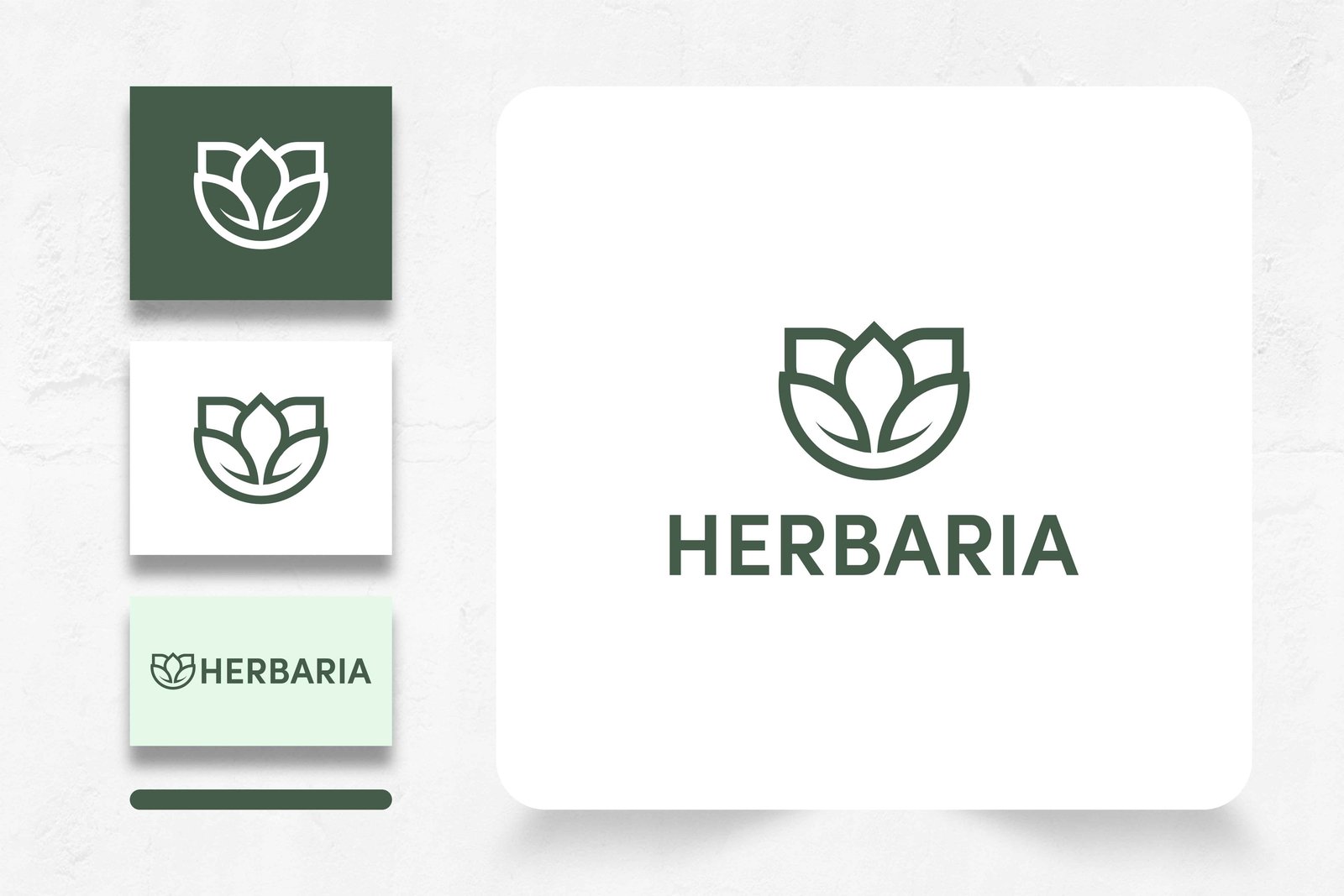
Herbaria sought a refined, nature-inspired visual identity that blended botanical purity with clean modern minimalism across skincare bottles, herbal hair oil droppers, interior studio signage, and digital touchpoints.
What needed to be solved.
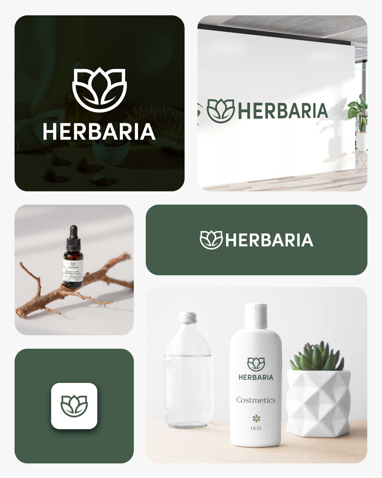
Balancing organic botanical warmth with crisp, contemporary minimalism that remains legible from small amber glass dropper labels and mobile app icons to full-scale studio reception walls.
Key project priorities
- Develop a geometric lotus-and-leaf line emblem paired with a balanced, modern sans-serif HERBARIA wordmark
- Create versatile vertical, horizontal, and standalone emblem lockups across deep sage-forest green and crisp white surfaces
- Extend the visual system across amber glass herbal hair oil droppers, minimalist cosmetic bottles, studio signage, and digital icons
How we executed the work.
Crafted a symmetrical three-petal botanical mark framed by cradled leaves in a calm, authoritative forest sage palette
Built a structured brand identity system establishing reverse-green, clean white, and mint-tinted horizontal lockup rules
Rolled out cohesive product packaging labels for Pure Herbal Hair Oil droppers, matte white cosmetic bottles, and interior wall branding
Deliverables & Business Impact.
Created an elevated, cohesive herbal beauty identity that communicates natural formulation quality across retail skincare packaging, physical spaces, and digital channels.
Related Work

4P Technologies — Enterprise ERP & Retail Platform
Repositioning an enterprise retail and ERP consulting provider with a high-clarity web platform and structured lead capture flow.
Prime Automation — Website Design & Digital Presence
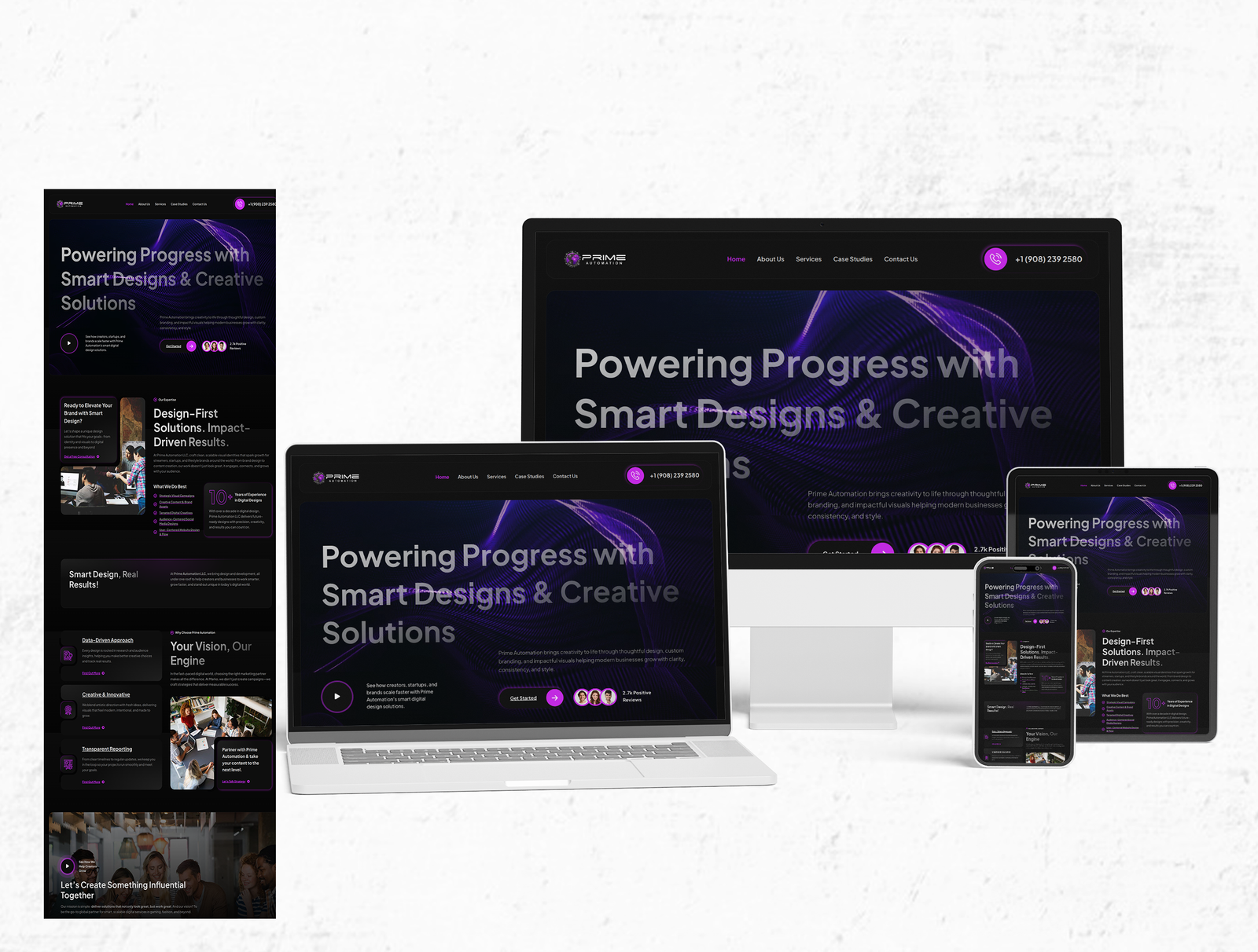
Designing a bold, conversion-focused dark website experience that showcases Prime Automation’s smart design and creative digital solutions across desktop, tablet, and mobile.
Solving a similar challenge in your business?
Let's talk about your project goals, timeline, and the right approach.