Empowered Healing — Brand Identity & Collateral System
Empowered Healing needed a complete visual identity system that communicated warmth, clinical professionalism, and emotional safety across both their core brand mark suite and real-world therapy clinic touchpoints.
What needed to be solved.
Many wellness brands lean either too clinical and cold or overly informal. Empowered Healing needed an identity that inspired immediate trust and calm for prospective clients seeking therapeutic support.
Key project priorities
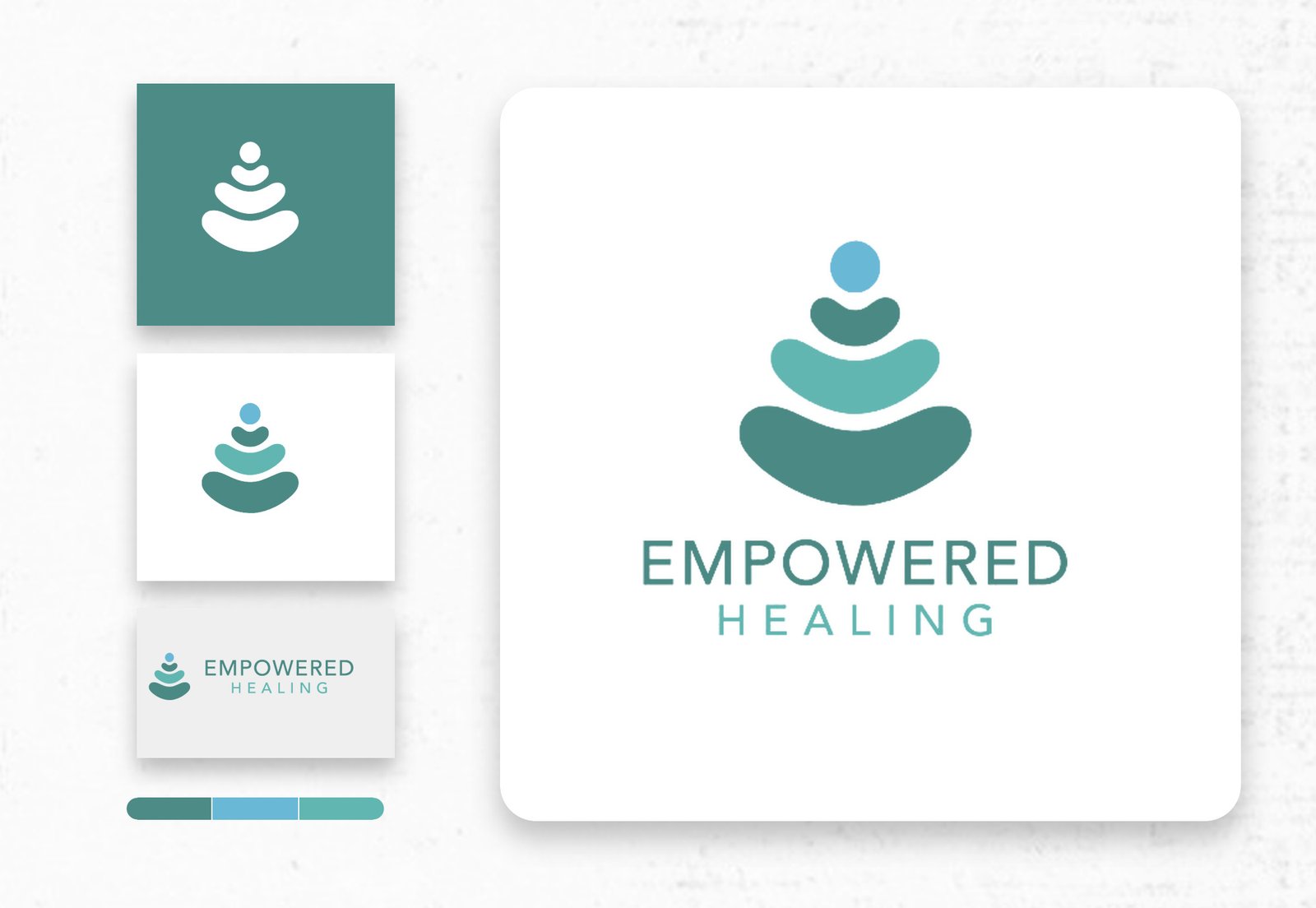
- Design a memorable stacked-stone balance symbol with vertical and horizontal lockup variations
- Establish a soothing three-tone colour system (deep teal, sky cyan, and seafoam sage) for print and digital
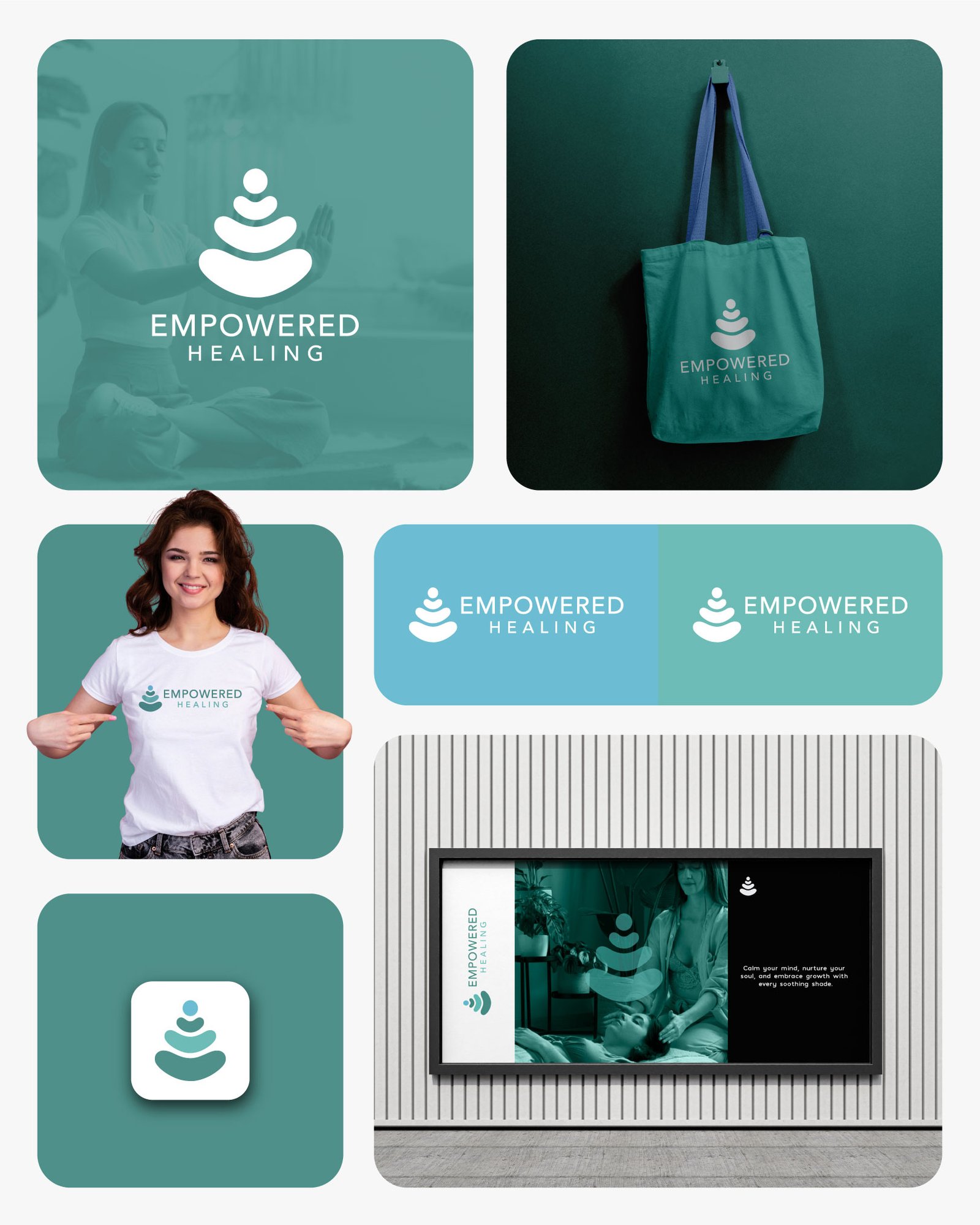
- Extend the brand identity seamlessly across apparel, organic tote bags, mobile app icons, and framed clinic artwork
How we executed the work.
Crafted a four-tier zen balance emblem symbolising steady emotional grounding, mindfulness, and personal renewal
Built a structured identity board defining reverse-teal, clean white, and horizontal lockup standards alongside colour swatches
Translated the visual system into tangible wellness merchandise, apparel, digital icons, and calming interior clinic signage
Deliverables & Business Impact.
Provided Empowered Healing with a cohesive, recognisable brand identity and physical collateral system that builds immediate serenity and trust across every client touchpoint.
Related Work
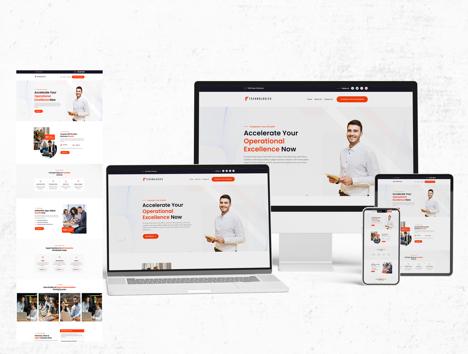
4P Technologies — Enterprise ERP & Retail Platform
Repositioning an enterprise retail and ERP consulting provider with a high-clarity web platform and structured lead capture flow.
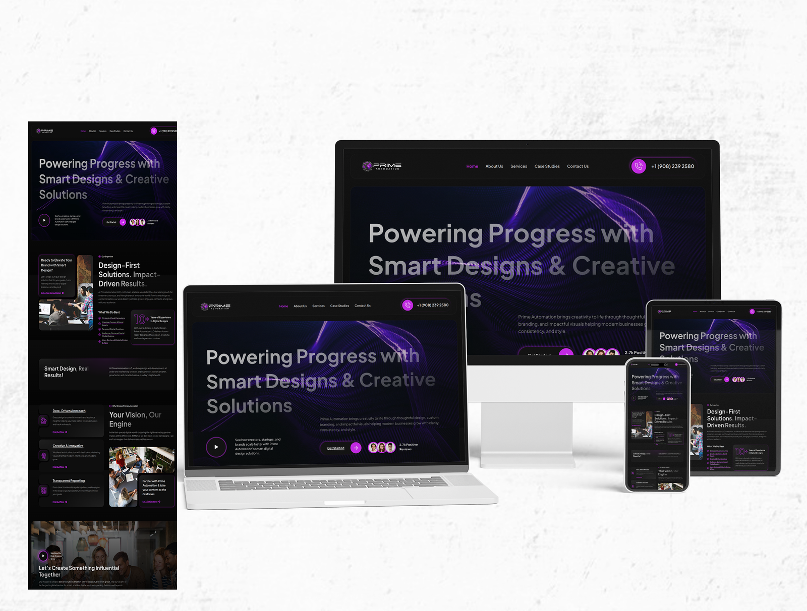
Prime Automation — Website Design & Digital Presence
Designing a bold, conversion-focused dark website experience that showcases Prime Automation’s smart design and creative digital solutions across desktop, tablet, and mobile.
Solving a similar challenge in your business?
Let's talk about your project goals, timeline, and the right approach.